The Untold Realities of Setting Up and Running Notification Infrastructure
Introduction
Most often than not, we have our own opinions and assumptions of how things need to be. Opinions are subjective, and while may be logical, may not be backed by valuable data. For example, you would think that you have nothing in common with a banana, of all things. But according to research, we have around 60% DNA match with bananas!
The ability to connect data to achieve or obtain meaningful conclusions is what it’s all about. Data-driven decisions for businesses lead to better progress, generally speaking.
Implications
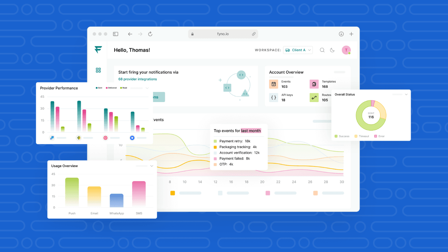
At Fyno, we’ve fallen head over heels with data. We take our analytics seriously, and we don’t shy away from proclaiming that. We’ve designed and delivered a dashboard with an intuitive design, with dynamic graphs and heat maps that capture data directly from the logs that are produced based on the application usage.
Of course, these are great. But in the blog, I’m going to get one step deeper and talk about the implications of retrieving such data to know how best to squeeze maximum use of the dashboard.
We'll go through each one of the below and understand how to read the data synced, and how each of them can be leveraged to the fullest.
Events
Channels
Integrations
Providers
Routing
Let's get started, shall we?
Activity Trends and Status Overview
Activity trend talks about activities that can be measured within the Fyno App within a set period of time, displayed on a timeline.
For the sake of convenience, in the screenshot above, the toggle-able menu has been collapsed, so that we know what we are working with, in this blog.
We will go through every feature and discuss what value-add they provide and what benefits you can reap out of them.
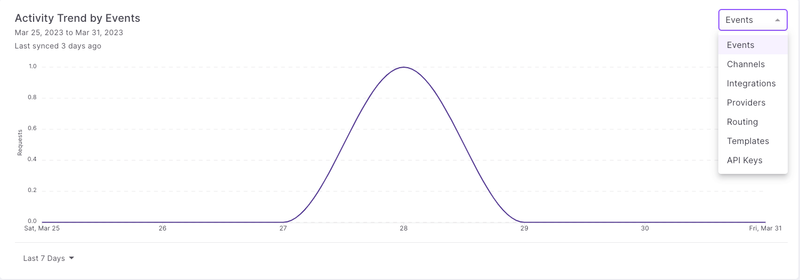
Events
Having an Activity trend for events adds important value to any company.
An event is basically a journey that is covered for a use case. An event covers the process and the content of how a notification goes out from the fyno application.
Let’s take an example to explain this.
Let’s say we have 2 events from a client whose running a tech-led business. Both these events are catering to helping customers to subscribe to 2 of their newsletters - one being generic, and the other focussing heavily on tech updates. Let’s assume both have been equally advertised and promoted.
Once both newsletters have been fired, a look back at the Activity Trends could help the client understand which newsletter performed better. Depending on the outcome that the data provides, it becomes easier for the internal teams to carve a path ahead on what they need to divert their focus towards and build a roadmap.
Channels
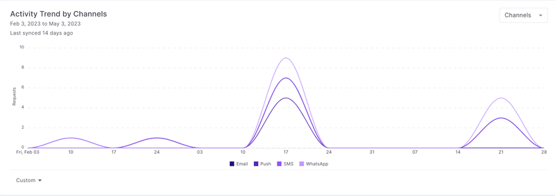
As we know very well by now, channels are the mode through which your notification is reaching the end client via SMS, Email, WhatsApp, Push or InApp, and more.
The easiest way to leverage the activity trend for Channel usage is to help you see what type of usage you have on each channel and help make solid data-driven decisions based on these.
Let’s try to walk through this with another example.
Let’s take 2 channels in play for this - WhatsApp and Email. We take a set user base to whom we trigger both email as well as WhatsApp messages, with identical content.
Once the notifications are live and a period of time has passed, the data gets stored on the dashboard for you to skim through. For the sake of this example, let’s assume that Whatsapp is shown to be trending higher than email. We can derive some conclusions from this, which may look something like this:
WhatsApp as a channel is preferred by the end-user
More interactions are seen with WhatsApp - likely due to interact-able conversations as well as CTA options that lead to stacked activities
Availability is higher on Whatsapp purely from an accessibility point
With this data, we can conclude confidently that Whatsapp as a channel works for this use-case, and this could prompt the client to increase the monthly consumption projections with our providers for this channel while dialling down the commitments and volumes for Email.
Integrations
Integrations are each of the providers' accounts that you have configured on Fyno. This can be 2 integrations under the same provider and can go up to 5 integrations per provider at the moment.
A big advantage of this feature is that different integrations allow you to have different configurations set up at the provider level, which can be handled via different accounts.
Having this kind of integration flexibility in place helps you streamline different types of traffic easily at a provider and integration level. Some benefits of breaking up traffic like this are:
Allows you to have an understanding of the performance of each provider integration
Does not hinder or block priority traffic as compared to what happens when having 1 integration to push all the traffic through.
Providers

Given the fact that every channel service we use, be it WhatsApp, SMS, Email or even Push, it’s a good practice to have more than 1 provider for each of them, for the simple fact that failover and building redundancy within a channel is important.
With this in mind, the activity trend for providers helps us with:
Understanding which Provider has been used or has recorded the maximum activity in a certain period of time.
Activity can also imply success rate for each provider overall. An important point to note here is that some of these providers may be plugged into the routes and as a result of failover and optimization, the success would be based on the impact that these actions have overall.
Let me try to expand on this with yet another example.
Let’s say that I create a route with 2 providers that I have partnered with, Twillio and MessageBird. I also additionally have a failover provider, Msg91, also configured to this route.
Let this route run for a month or so, to see how they fare.
At the end of a month, when I check the trends for the route on the dashboard, let’s say I see that most of the traffic has been routed through Msg91, my failover provider. This then prompts me to check the performance logs as to why the main 2 providers, Twilio and MessageBird, did not work, and I would either make adjustments to the route or change whatever is causing the failures.
Routing
Routing activity trends help you understand which route, regardless of the channel, has been trending.
Routing trends help you understand multiple things, a few of which are:
The best-performing route based on channels. Having a combination of routes and different providers plugged in, especially when trying to do A/B testing is required, this activity trend comes into play.
Usage Overview
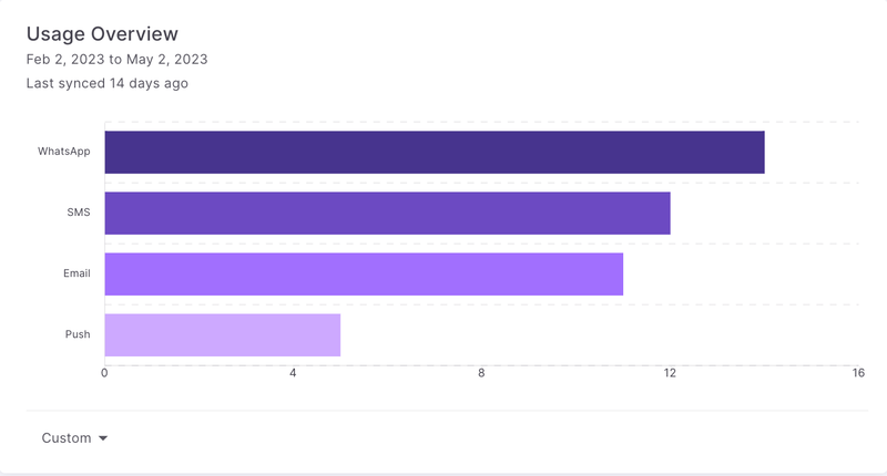
Usage overview has been designed to give you an understanding of the overall usage of each channel, with a toggle option for the time period.
The difference between Usage Overview and the Activity Trend is that while the former gives you a look into the weekly or monthly graph of the performance, the latter shows you the overall usage of each channel for the given period of time, consolidated.
This, again, helps you draw a few conclusions that help you along your notification journey, like:
An idea of how the trends of usage would be and provide projections of the same to necessary partners and internal teams.
Helps tally and reconcile usage with the partners. Provides another system to track the notifications sent out, channel-wise.
Overall Status
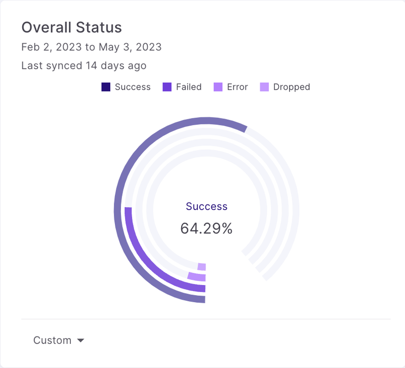
Overall status gives us an understanding of what exactly the success rate of the entire volume of traffic for a set period of time was.
This is very essential to understand the same, as any deviation on a set standard for aspects like SLA can be easily diagnosed from this chart at a glance, and immediate remediation plans can be carried out for it.
Apart from this, understanding the delivery percentage also gives insights into your database when it comes to marketing, especially when you do campaignsetc. Delivery rate plays an important role to help you weed out the end users’ details which have failed, in order to optimize your next campaigns.
Sent by Time of Day
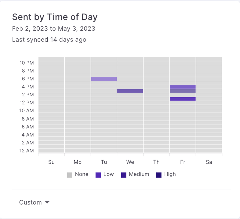
Sent by time of day shows you the data of every notification sent via the application, relative to the time of day that it was sent.
By choosing your time range, you can see trends of usage by time of day, which is a super important feature, since this gives you an understanding of your end customer behaviour.
For example, If I have signed most notifications triggered between 7 PM- 9 PM for a period of one month, I will then infer that most of my clients are being directed towards my product or application at that time.
This will then drive me to see what exactly are the kind of nudges or ads that are currently running at this time slot and see how I can further improve and leverage this.
I would then also optimize my marketing strategies to switch to alternatives like Push or InApp at that time for my end customers coz the chances of them being on the application already is highly likely in this time slot, saving myself a pretty penny in the process.
These are just some of the implications of the Dashboard that Fyno has built for you.
I’m sure there are more inferences that can definitely be derived from these insightful graphs and trend monitors, which would add to the overall value and outcomes of the notification journey for you as well as your end customers.